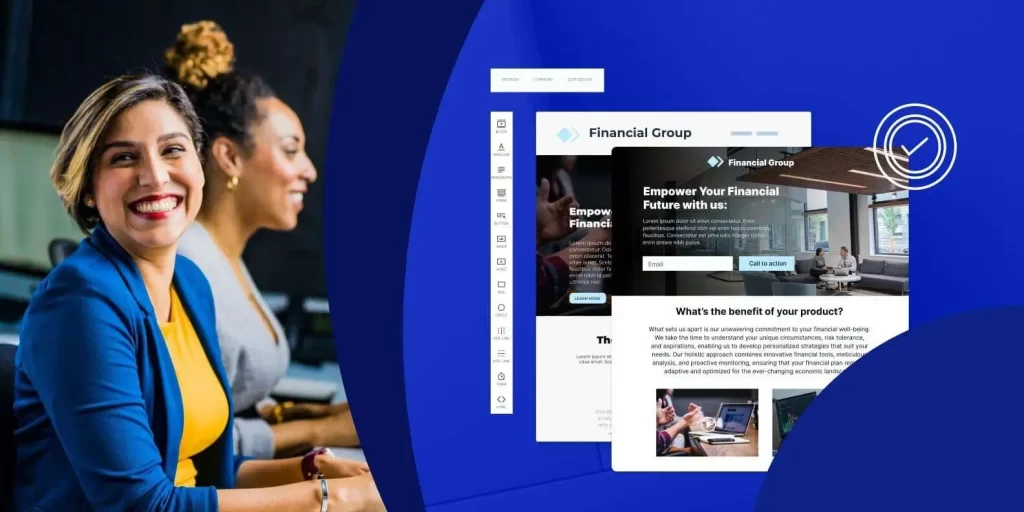
to Create Landing Pages for Financial Services that Convert.
Online searches are the first step for many consumers of financial services and technologies. One study found that 41% of the web traffic for the finance industry is derived directly from organic searches. It’s important for financial services marketers create campaigns that engage customers at each stage of their digital journey.
For a click to become a customer, it is important to have relevant ad-to page journeys, and landing pages that convert well.
Most consumers do not take decisions like refinancing their mortgages, applying for business loans, or opening a checking account lightly. Before making a decision, they weigh their options and gather all the information necessary. How can you, as a marketer in the financial services industry, strike the perfect balance with your campaigns? How can you give your customers the information and transparency they need, without making them feel overwhelmed when they arrive on your site?
Finding the right balance between user-friendly and informative design is key. We’ll dive into the best design practices for a financial services landing page.
Design with Clarity in Mind
Your financial landing page must guide visitors seamlessly through the decision-making process. Begin by capturing attention with a clean layout and an engaging hero section. The headline and copy should also be persuasive and concise.
Here are a few ways to design your landing page for clarity:
- Use white space to enhance your content and create visual breathing space.
- Remove navigation menus or links that may divert attention from your main call-to action (CTA).
- To create a professional and cohesive look, keep branding elements such as fonts, colors and images consistent.
- Benefit-led messages are more effective than feature-led messages.
Information that is digestible
Unorganized or overwhelming landing pages can result in a bad user experience. By making information easily digestible, you can improve the usability of the page. Visitors will be able to navigate the content without feeling frustrated. Financial services are complex. By breaking information down into smaller, more digestible chunks, you can help users better understand the content, reduce confusion, and increase conversion.
You can easily digest information by using these tips:
- Avoid using unnecessary technical terms and complex explanations. Use simple language that your audience can easily understand.
- To make information easier to scan, use bulleted lists or numbers. This format helps users quickly grasp important information and key points without having to read long paragraphs.
- Visualize information using images, charts or graphs. Visuals make data easier to comprehend, especially if they are accompanied by concise descriptions.
- Add Interactive Elements
Interactive elements such as calculators, quizzes or interactive infographics attract visitors and encourage them interact with your content. These elements provide a dynamic and engaging experience, compared to static images or text. This makes your landing page more effective. By using calculators and tools that are tailored to the user’s needs, they become more engaged with the information presented. They will also be more inclined to explore further.
You can include interactive elements on your landing pages for financial services:
- Calculators: Users can input specific information to receive instant calculations relating to mortgage payments or loan affordability. They can also calculate retirement planning, investment returns, and savings projections. These interactive tools allow users to visualize the impact that your financial services have on their own personal situation.
- Quizzes and Assessments: Interactive assessments or quizzes can be used to help users assess their financial goals, tolerance for risk, or knowledge of finance. These interactive elements offer personalized feedback and recommendations, based on the responses of users. This makes information more relevant and engaging.
- Interactive Decision Trees – Decision trees are interactive tools that guide users through a series or choices based on the user’s needs and preferences. This interactive element guides users through complex financial decisions, by providing personalized suggestions or guiding them towards the most relevant information in your landing page.
Offer Conversion Opportunities that are Frictionless
Lead generation is streamlined by a frictionless conversion. You can increase the efficiency of lead generation by making it easier for visitors to express their interest or provide contact information. Lead capture is easier with frictionless forms that have minimal fields required and clear calls to action.
You can make your landing page for financial services frictionless by following these tips:
- Optimize your landing page to load quickly. Slow loading pages frustrate users and can increase abandonment. To improve the speed of page loading, compress images, use caching techniques and reduce the use heavy plugins or scripts.
- Reduce the number of fields required to only the most important. Use smart form fields to auto-fill data where possible. This will save time for users.
- Use CTAs that are prominent and clear to communicate what you want your visitors to do. CTAs should be placed throughout the landing page and not only in the header. This will allow visitors to convert at any stage of the experience.
- Visitors who have questions or require immediate assistance can be assisted by offering live chat or clear contact information.
Bonus tip: Always optimize your landing page for mobile viewing! Over the past few years, mobile searches for financial planning and management has grown by 70%!
To create a landing page that converts well, you need to pay attention to the details and have a thorough understanding of what your audience wants. Follow the steps in this blog to create a landing that will captivate potential customers and guide them smoothly toward conversion.
Test and optimize your landing page for financial services regularly to ensure that it is aligned with the latest trends. Don’t forget the power of analytics and data to gain insight into user behavior.
Are you ready to try these steps out on your landing pages? Sign up for a free 14-day trial today and discover the impact Instapage can have on your campaign!
