At Instapage, we know one of the most rewarding and creative people to market to are, well, other marketers! In the world of marketing and advertising, staying ahead of the competition requires a strategic approach and a deep understanding of what drives customer engagement and conversions. That’s why we’re excited to share seven proven tactics for optimizing your marketing and advertising services through effective landing pages.
These tactics have been carefully curated and tested by our marketing team here at Instapage to help you enhance your campaigns, boost your conversion rates, and maximize your return on ad spend. Whether you’re a seasoned marketer or just starting, these tactics will provide you with actionable insights and practical tips to take your campaigns to the next level! So, let’s dive in and discover the secrets to achieving marketing success through these powerful tactics.
Match the message in your ad to your landing page
When crafting landing pages for your marketing and advertising solutions, aligning the message between your ads and landing pages is crucial. This alignment creates a seamless and relevant experience for your visitors. By maintaining continuity from the ad to the landing page, you validate their initial interest and meet their expectations. This not only increases engagement but also enables them to evaluate your solution quickly.
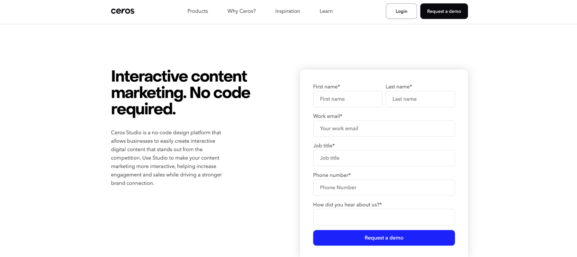
Take this example from Ceros. The search term used was “marketing content solutions”, which produced this offer from Ceros claiming they could support creating interactive content.

When you click on the ad, you are greeted with a repeated promise that Ceros can help marketers create interactive content. This message match, personalization to the audience, and the CTA all work together with the original ad to validate the visitor’s initial interest and meets marketers’ expectations for a tool that can support their content marketing efforts.

Aligning your messaging enhances your Google Quality Score, which in turn positively impacts your ad performance. By reducing friction and confusion, you streamline the user journey–making it effortless for visitors to take the desired action on your landing page. This cohesive alignment significantly improves the likelihood of conversions as visitors are presented with a persuasive narrative that reinforces their interest. So, remember, when creating your landing pages, ensure that your ads and landing page content align seamlessly to drive optimal results and maximize your advertising success.
Use only one CTA
Having a single Call-to-Action (CTA) helps maintain a clear and focused objective for your landing page. It eliminates potential distractions and ensures that visitors are guided toward a specific action. For example, if you have a CTA in your hero section that says “Sign Up For Your Free Trial” and another CTA down the page that says “Learn More” visitors may not be sure which one to click or which one better aligns with their intention.
Riverside, a podcast marketing & creation platform, does a great job of having one central CTA message. Although they offer multiple areas to convert, including as a scrolling CTA, in the hero section, and at the end of the page, all these CTAs have one repeating message: “Get Started.” This highlights to the visitor, that no matter where they convert, they’re going to a centralized location that will enable them to start creating podcasts with Riverside.

A single CTA enables you to align the messaging throughout your landing page consistently. This coherence reinforces the value proposition, benefits, and urgency related to the desired action. It prevents conflicting or diluted messages that could arise from multiple CTAs, allowing you to create a persuasive narrative that motivates visitors to take the desired action.
Support multiple buyer preferences on your landing page
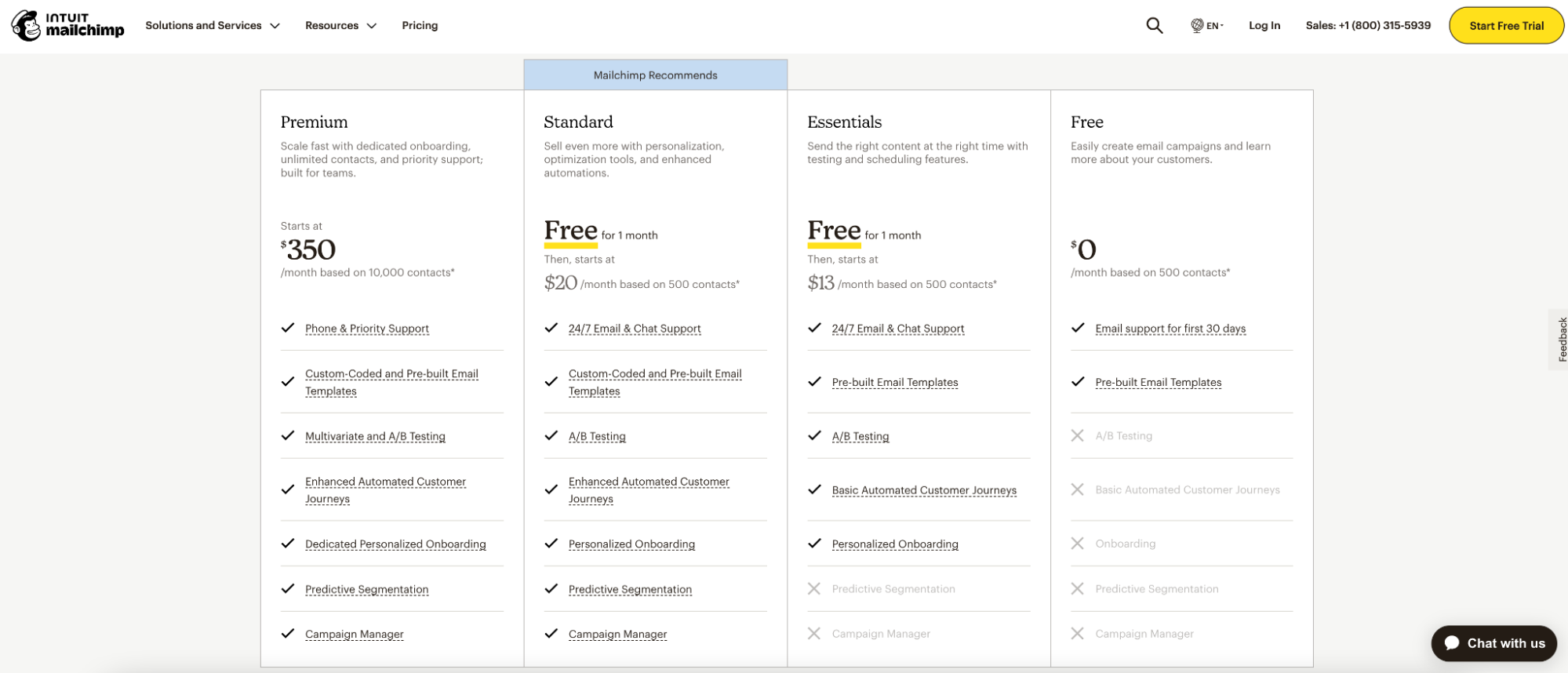
To effectively support multiple buyer preferences on your landing page, you need to prioritize personalization and flexibility. One great way to do this (and build trust at the same time) is to provide a section with transparent pricing tiers for your product or service. When you offer a concise breakdown of each pricing plan and its included features, you empower your customers to make well-informed decisions that align perfectly with their unique needs and budget.
MailChimp includes a well-laid-out pricing plan that highlights all four of their plans, including their free plan, and clearly highlights what is included in each pricing tier. They even include a small blue box that highlights their recommended plan which is not the highest priced plan. Choosing the Standard plan, instead of Premium, as their suggestion for those getting started with MailChimp further builds trust with the visitor that they aren’t getting over-sold something.

This transparent approach ensures a smooth and frustration-free experience, as customers gain clarity on what they can expect from their purchase. When you provide all the options up front, you help eliminate confusion and foster confidence in their decision.
Add a scrolling CTA
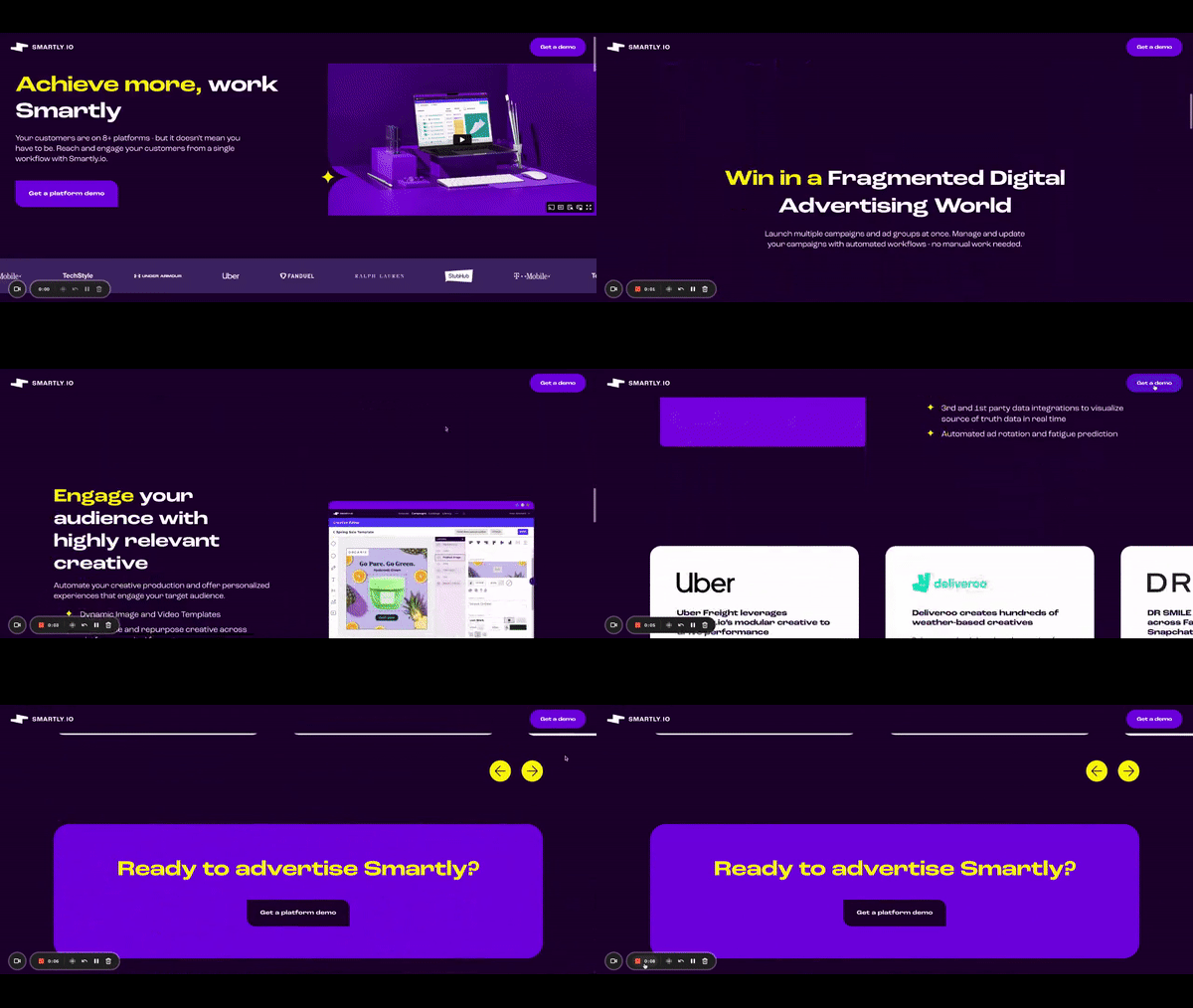
By incorporating a scrolling CTA, you ensure that the call-to-action remains visible to visitors as they explore the full length of your landing page. As they scroll through the content, the CTA remains in view, maintaining its presence and encouraging engagement. A scrolling CTA also contributes to an improved user experience by providing a seamless and uninterrupted flow. Visitors can engage with the content, absorb the information, and easily take action without disruption. This positive user experience can lead to higher engagement and conversion rates.
As you can see in the gif below of Smartly.io landing page, they include a navigation bar that includes a CTA that scrolls with you on the page. Bonus points to them for the naming consistency of their CTA, too!

It’s important to remember that a scrolling CTA can also be optimal for mobile users. Visitors using their phones often scroll extensively, and a fixed or scrolling CTA ensures that the call-to-action remains accessible and prominent, regardless of their particular screen size or orientation. This mobile optimization helps capture conversions from a significant portion of your audience.
Let visitors see real results
Fellow marketers who are creating landing pages for their marketing and advertising solutions should prioritize including social proof on their websites for a few reasons. When potential customers see tangible evidence of the positive outcomes others have achieved through your solutions, it instills confidence in the effectiveness of your offerings. These can be quotes from customer reviews, logos of prominent brands you have partnered with, case studies, or even video interviews!
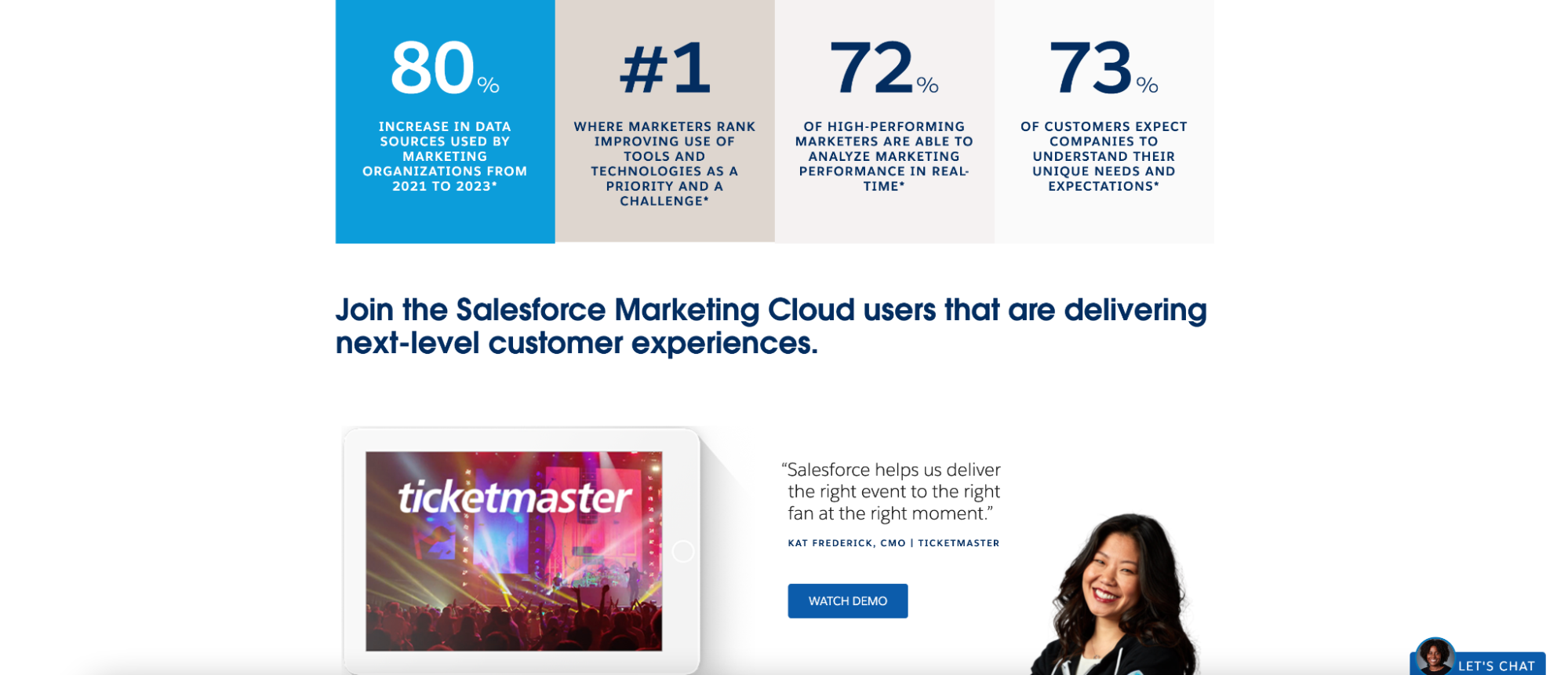
On Salesforce’s landing page for their Marketing Cloud solution, they include a mix of interesting social proof elements, including a range of statistics and a review from the CMO of a major brand, Ticketmaster to build trust and interest with their potential customers.

Secondly, displaying real results helps potential customers envision the benefits they can expect. When visitors see real-world examples of how your services have solved specific challenges or generated desired outcomes, it helps them understand the practical applications and potential impact of your offerings. This visualization enhances their engagement and encourages them to consider your solutions for their own needs.
Furthermore, sharing real results on your landing pages differentiates you from competitors. It showcases the unique value and expertise you bring to the table. By presenting evidence of your track record in delivering results, you establish a competitive advantage and stand out as a reliable and trustworthy provider.
Use thank you pages to your advantage
When promoting your marketing and advertising solutions, you have the opportunity to showcase your expertise and thought leadership in the industry through compelling content such as ebooks, webinars, podcasts, and other valuable resources on your thank you page. These resources often require visitors to provide their email addresses to access the gated content, which leads to a thank you page. But are you leveraging your thank you page to its fullest potential?
At Instapage, our thank you pages include a wide array of our latest marketing resources, links to our social media profiles, and a call to action to sign-up for our marketing newsletter, The Marketing Method to stay up-to-date on the latest marketing trends & tactics.

Thank you pages not only convey gratitude but also offer a chance to extend the visitor’s engagement with your brand. By including relevant and valuable resources on the thank you page such as related content, blog posts, or product recommendations, you can keep the visitor on your website longer and deepen their relationship with your brand. This continued engagement nurtures their interest and increases the likelihood of future conversions or interactions.
Additionally, thank you pages can be leveraged for cross-selling and upselling opportunities. If the visitor has completed a purchase or expressed interest in a particular product or service, the thank you page becomes an ideal space to showcase complementary offerings, limited-time promotions, or exclusive discounts. This strategic approach maximizes revenue potential and capitalizes on the customer’s existing engagement.
Leverage remarketing to guide people along the buying process
Remarketing allows you to re-engage with visitors who have previously interacted with your landing pages or website but may not have completed the desired action, such as making a purchase or filling out a form. Typically, B2B efforts have a longer funnel, and just because a potential customer clicked off your page without converting doesn’t mean they’re not interested in your offerings. By strategically targeting these individuals with tailored advertisements across various platforms, you can stay top-of-mind and gently guide them back into the buying process.
Remarketing also allows marketers to optimize their advertising budget. Since remarketing targets individuals who have already shown some level of interest, the chances of conversion are often higher compared to targeting a cold audience. This means that you can allocate your ad spend more efficiently and achieve a better ROI.
By staying connected with potential customers and gently nudging them back into the conversion funnel, remarketing can significantly improve your chances of driving conversions and maximizing the effectiveness of your landing pages.
Conclusion
We hope these insights and strategies have inspired you to take your landing pages to new heights and optimize your campaigns for success. Remember, by leveraging these tactics, you can enhance the relevance, engagement, and conversion rates of your landing pages–driving tangible results for your marketing and advertising efforts. Keep implementing these tactics, refine your approach, and watch your results grow.
Are you ready to elevate your marketing game with high-converting landing pages? Sign up today for a 14-day trial and see the impact Instapage can have on your campaign results!
