When it comes to digital marketing, we must look at the best landing page examples of the top industry leaders to improve and learn from.
After all, these action-oriented, standalone web pages are pivotal for moving people through every stage of the buyer’s journey. And if well-established companies are using landing pages, then it must be an integral piece of any marketing strategy — particularly at an enterprise level.
Below, you’ll find the best landing page examples of 25 top companies. Read through them to start learning from the best to create a highly effective landing page of your own. You may also click through on the brand’s name to find a dedicated article with even more examples from that particular brand.
25 top companies with the best landing page examples
(Keep in mind, for shorter pages, we’ve shown the entire page. For longer pages, we only displayed above the fold. You may need to click through to the landing page example to see some of the points we discuss. Also, some sites may be A/B testing their pages, meaning you may be served an alternate version.)
1. Slack landing page example
What the page does well:
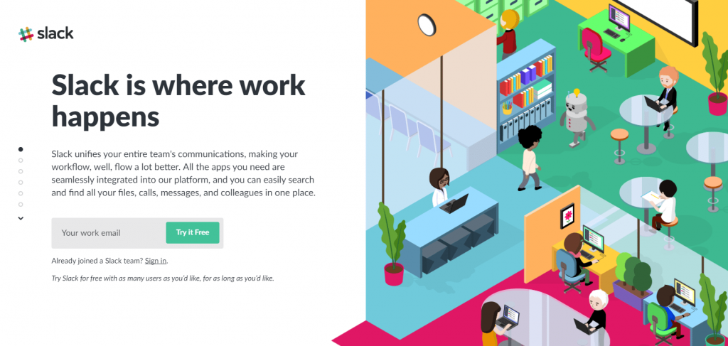
- Unique scrolling style allows all necessary information to be displayed allowing visitors to receive information without having to move up and down the page.
- The lead capture form is consistently present as users scroll through the content.
- The CTA button copy is compelling because it’s short, direct, and uses the word “free.”
- Only one form field makes it highly likely that visitors will complete the form.
- The images are bright, engaging, use brand colors, and are relevant to each corresponding section.
- Use of social proof is likely to make visitors feel compelled to use Slack.
What to A/B test:
- There are several exit links, including the Slack logo, “Sign in,” “See all apps,” “See customer stories,” “product,” “pricing,” and “Enterprise Grid” — making it more likely for visitors to leave the page without converting.
- No privacy policy might deter prospects from handing over their email address.
2. Marketo landing page example
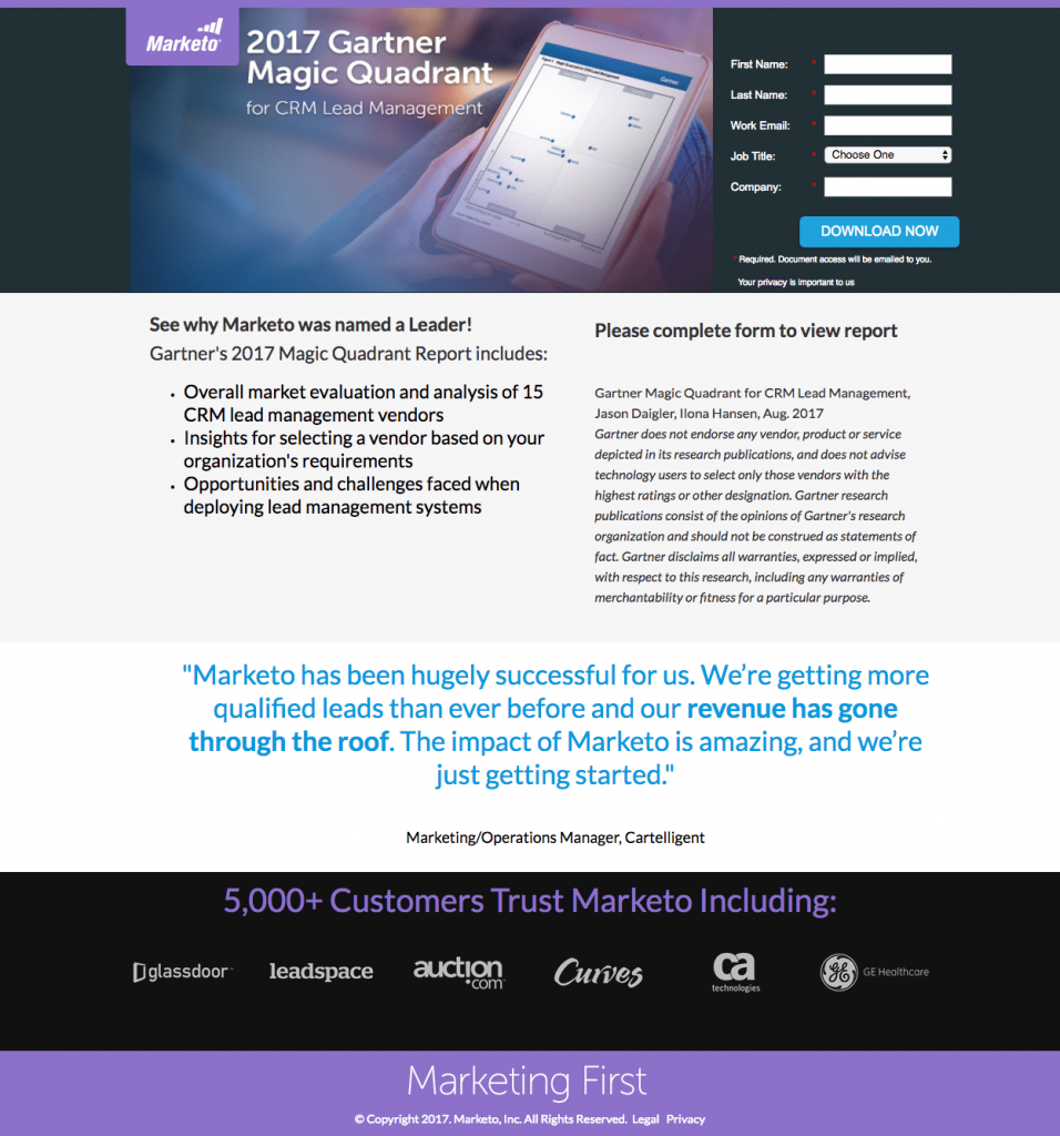
What the page does well:
- The headline tells visitors exactly what the report is about.
- The image shows visitors what they can expect to receive should they choose to download the report.
- Bullet points allow prospects to quickly scan the page to find out what the report includes.
- Social proof – a customer testimonial and company badges – adds trust value to the offer and the company as a whole.
What to A/B test:
- Exit links – the Marketo logo and the Legal link in the footer – provide visitors with a way to leave the page without downloading the report.
- The 5-field form might be intimidating for someone in this consideration stage of the buyer’s journey. Removing “Job Title” and “Company” might encourage more visitors to complete the form.
- The CTA button color doesn’t stand out as much as it could because it’s used elsewhere on the page.
- The CTA button copy is vague. Changing it to something like “I want the report!” might encourage more prospects to click.
- The large block of italicized copy doesn’t seem necessary, and removing it might produce better conversion results.
- Including a full name and headshot to the customer testimonial could improve its credibility.
- Adding white space would help the page look less crowded and more aesthetically appealing.
3. Oracle landing page example
What the page does well:
- The Demand Gen Report statistic in the copy isn’t “recent” like it states — it’s from before 2016, while the copyright date on this page is 2017.
- The “HTTPS” URL ensures visitors that Oracle’s site is safe and secure and that outsiders won’t be able to access their information.
- The image of the white paper provides visitors with a preview of what they can expect to receive by downloading the white paper.
- The contrasting color of the form stands out and draws attention, enticing visitors to complete it.
- The unchecked opt-in box ensures that prospects who opt-in want to receive emails from Oracle.
What to A/B test:
- The company logo and navigation at the top of the page could potentially remove visitors from the page without downloading the white paper.
- The small copy on and beneath the form fields is difficult to read.
- The white CTA button doesn’t stand out as much as it could because there is white at the top and bottom of the page.
- Exit links in the footer provide visitors with even more ways off the page.
4. Google Hire landing page example
What the page does well:
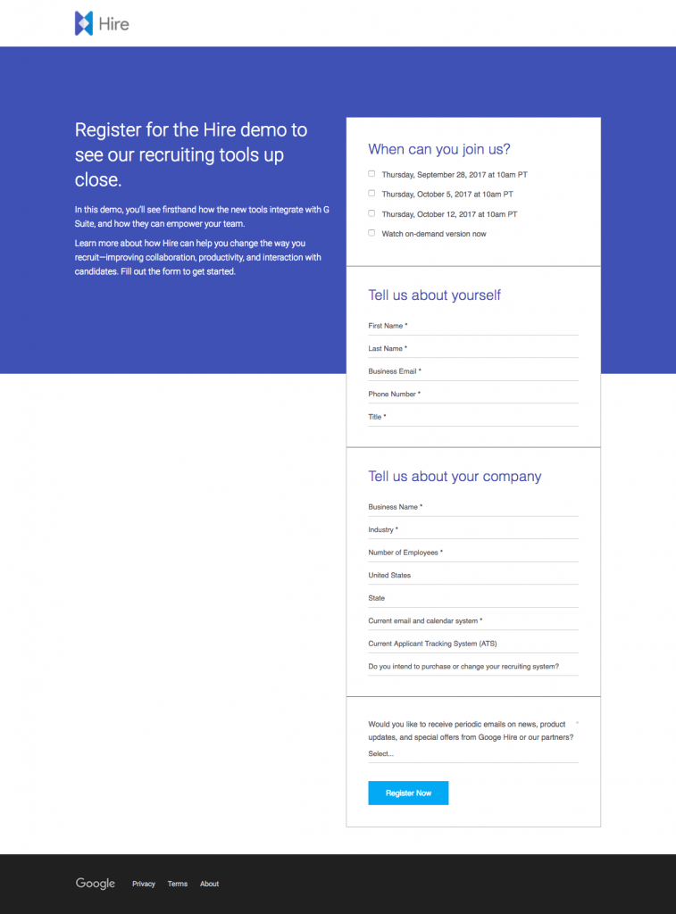
- The Hire logo in the top left corner immediately lets visitors know where they are when they land on the page. The fact that it’s not hyperlinked also won’t let people click away making this a great landing page.
- The clear headline tells prospects the demo will include information about recruiting tools.
- Minimal, to-the-point copy allows visitors to quickly read through and determine if they want to convert on the offer.
- Encapsulating the form helps it stand out on the page, likely increasing conversion rates.
- The privacy policy link in the footer adds trust value, making prospects feel more comfortable with submitting their personal information.
What to A/B test:
- Message match could be improved. I was taken to this landing page from a Hire webinar promotion with a CTA button encouraging visitors to “Sign Up” for the “upcoming webinar”. The landing page does not mention a webinar at all, but instead, promotes an on-demand demo. If Google Hire considers their webinar and demo to be the same thing, increasing the message match between the two pages would likely diminish any confusion in visitors.
- 14 form fields is a lot, even for the consideration stage of the marketing funnel. Breaking this up into a multi-step form could reduce form friction and result in more conversions.
- The turquoise CTA button is similar to the other shade of blue on the page. Making it more contrasting, like orange, would make it “pop” more.
- The page is unbalanced. Including an additional landing page element to the left of the bottom of the form, such as a customer testimonial or an engaging image, could make the page more aesthetically pleasing.
5. Toggl landing page example

What the page does well:
- The headline explains what Toggl helps users do: frictionless, easy, and powerful time tracking.
- The CTA button reiterates the offer (track time for free), and the button color contrasts with the background color.
- The customer count and logos help instill social proof and establish credibility for the time-tracking tool.
- The product screenshots help the visitors visualize how easy it will be to work on Toggl.
What to A/B test:
- Header and footer navigations can easily distract visitors from the page offer and send them away without converting.
6. IBM landing page example
What the page does well:
- The headline is distinct and intriguing, compelling visitors to continue down the page to learn more about the offer.
- Minimal copy provides a brief overview of the white paper without overwhelming prospects with unnecessary information.
- Providing the option to switch languages is a great idea in theory. Unfortunately, when visitors select another language, they’re brought to the homepage instead of directly translating this landing page.
What to A/B test:
- Header and footer navigations could easily distract visitors from the present offer and send them away from the page without converting.
- Balancing the page by adding an image or customer testimonial on the left side would make it more visually appealing.
- The CTA button could be improved according to our landing page best practices. The color could be more contrasting and attention-grabbing, and the copy could be more customer and benefit-oriented.
7. LendingClub landing page example
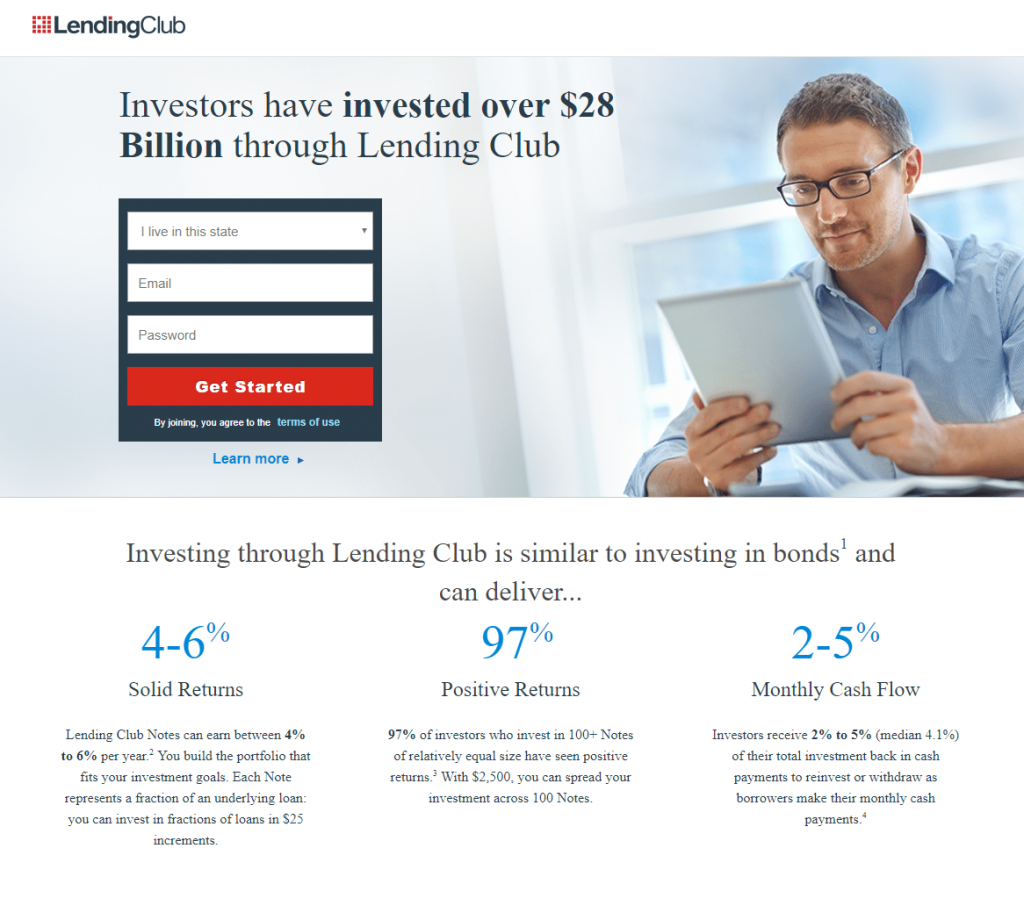
What the page does well:
- The headline uses bold formatting to highlight the value proposition.
- Encapsulating the form with color contrast makes it attention-grabbing.
- The red CTA buttons contrast and stand out on the page, likely increasing conversions.
- The “Investing through LendingClub” section provides the main benefits of partnering with the company, without filling the page with overwhelming amounts of copy. Plus, the specific percentages of investments serve as social proof.
- The company logos also act as social proof and let visitors know that many big-name brands recognize and trust LendingClub.
- Multiple CTA buttons provide prospects several chances to convert on the offer.
What to A/B test:
- Multiple exit links — the LendingClub logo, “terms of use,” “Learn more,” several words in the fine print, and the footer navigation — could remove visitors from the page without converting.
- Shifting the direction of the man’s eyes in the photo to look at the lead capture form might subconsciously encourage more visitors to complete it.
- Changing the CTA button copy to something more engaging and compelling like, “Start investing now and earn returns!” may result in more conversions.
- The excessive amount of fine print at the bottom of the page is intimidating and could make prospects wonder if the company has a hidden agenda.
8. Intercom landing page example
What the page does well:
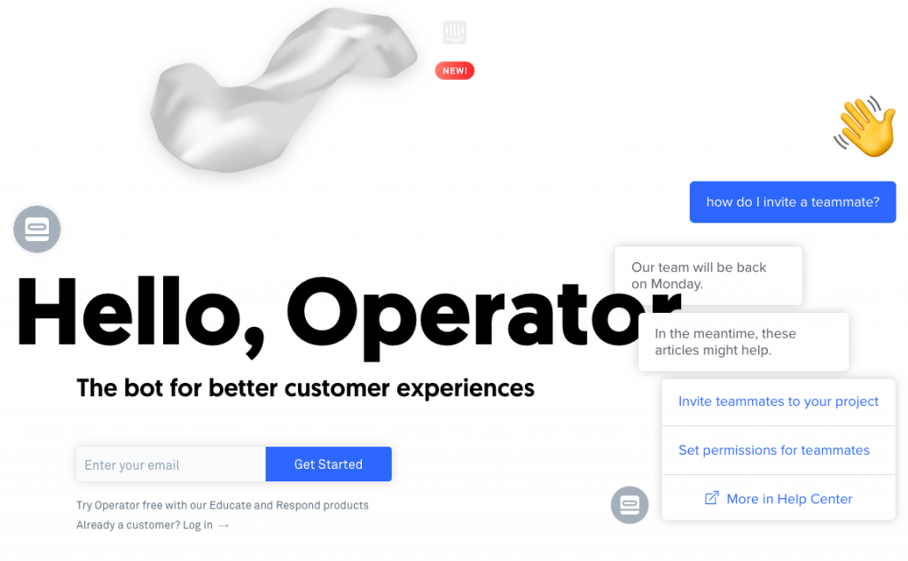
- Humor, especially in the “Bots today are really annoying” section, helps build a close, empathetic, human connection with visitors.
- Section headers with minimal copy tell prospects what Operator includes (and how it can benefit them) without filling the page with unnecessary text.
- Sufficient white space makes the page more navigable and digestible.
What to A/B test:
- The headline is partially hidden. The text boxes covering it up could be moved over slightly, so the whole headline is visible.
- Multiple exit links — the Intercom logo at the top and bottom of the page, the login link beneath the first form, and the “Learn more” link beneath the second form — could distract visitors and remove them from the page before converting.
- The form and CTA button blend in with the rest of the page because many elements on the page are formatted similarly and appear clickable.
9. Microsoft landing page example
What the page does well:
- A benefit-oriented headline lets visitors know that they could improve their team’s mobile productivity with Office 365 and encourages them to learn more with the ebook.
- The product image shows prospects what they’ll receive if they choose to download the ebook. Enlarging it and making it more realistic might improve conversion results even more.
- Bullet points with minimal copy allow prospects to scan the page for the relevant information.
- The encapsulated form stands out, directing a visitor’s attention to complete it.
- The green CTA button is attention-grabbing because it contrasts well with the rest of the page.
What to A/B test:
- The hyperlinked Office logo could take visitors away from the page without seeing the offer and converting.
- The image of the man seems irrelevant to the offer. Replacing it with a person using Office 365, or reading the ebook, could be more efficient.
- Eight mandatory form fields might be intimidating for somebody who’s only in the consideration stage of the buyer’s journey.
- The CTA copy isn’t precise or enticing. Changing it to something more personalized and exciting like, “Send me the eBook!” would likely encourage more prospects to click.
- “See plans and pricing” at the bottom of the page might distract visitors from the main offer and prevent them from converting.
- Adding social proof, such as a customer testimonial or trust seals, would increase credibility.
10. Lyft Landing page example
What the page does well:
- The subheadline serves as social proof, letting visitors know that others have made great tips working with Lyft.
- Only one field form requesting a phone number is quick and easy to complete so that it won’t turn off many prospects.
- Leaving the opt-in box unchecked makes candidates feel that the choice is entirely up to them.
- “Get a $250 bonus” is likely a compelling incentive for many prospects.
- The “Apply Now” CTA button is an anchor tag that brings prospects to the top of the page to quickly complete the form.
- The calculator feature allows visitors to determine how much money they could earn if they choose to drive with Lyft.
- The “Why Lyft” section uses iconography and minimal, simple copy to convey the main benefits of working for Lyft.
- The “How Lyft Driving Works” slider explains how Lyft works using the mobile app.
- “Lyft Insurance Protection” and “Passenger Ratings” provides drivers reassurance when it comes to driving for Lyft.
What to A/B test:
- Many exit links — including the Lyft logo and several hyperlinked words throughout the copy — could distract visitors and take them away from the page without converting.
- The headline is Lyft vs. Uber, but there’s nothing else on the page that compares the two services.
- The white text doesn’t show up against the white logo on the man’s shirt.
- Redirecting the man’s eye gaze to the lead capture form might result in more visitors completing it.
- The CTA button copy, “Next,” is as boring as it gets. Changing it to something more engaging like “Start making money now!” would likely improve conversion results.
- The pink CTA button doesn’t stand out as strongly as it could because pink is used so elsewhere on the page.
11. Constant Contact landing page example
What the page does well:
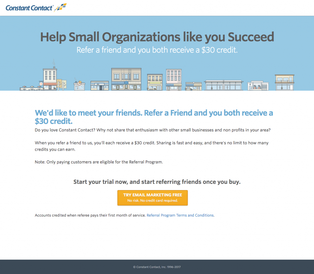
- The headline and subheadline are both benefit-oriented and support each other well.
- Minimal copy allows visitors to understand the offer without becoming overwhelmed by excessive text.
- The orange CTA button stands out because it contrasts well with the rest of the colors on the page.
- The click-through design with the lead capture form on the following page allows visitors to obtain all of the information about the offer without being distracted or intimidated by a form.
What to A/B test:
- The hyperlinked Constant Contact logo could immediately take visitors away from the page without seeing the entire offer.
- The CTA button has too much copy, which makes it small and difficult to read. “No risk. No credit card required.” could be moved beneath the button.
- No privacy policy might make prospects hesitant to convert.
- Adding social proof, such as a customer testimonial, would likely make candidates feel more confident in their decision to sign up with Constant Contact, increasing conversion rates.
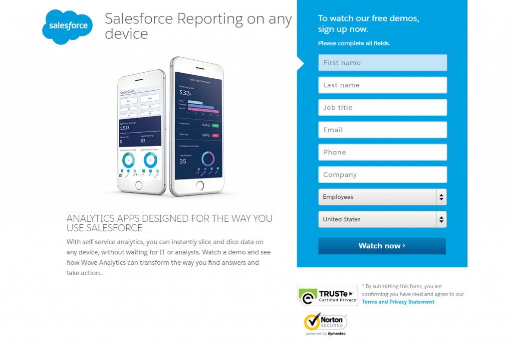
12. Salesforce landing page example
What the page does well:
- The primary and secondary headlines are compelling because they acknowledge an issue and provide a solution.
- The image provides visitors with a look at the Wave Analytics mobile app.
- Minimal, precise copy describes the offer without filling the page with overwhelming text.
- The color-contrasted encapsulated form helps it stand out and likely encourages more prospects to complete it.
- The arrows — one pointing to the first form field, and one on the CTA button — serve as directional cues.
- Trust badges and a privacy policy help prospects feel confident that their personal information will remain safe and private.
What to A/B test:
- Exit links — the Salesforce logo, trust badges, social media links, and footer links — serve visitors with an easy escape from this page.
- 8 form fields might deter visitors from completing the form. Removing unnecessary requests, or changing it to a multi-step form, would reduce friction and produce more downloads.
- The blue CTA button blends in with the blue form. Testing it in a more contrasting color (like orange) would likely grab more visitors’ attention.
- The CTA button copy could be improved to something more enticing, like “Show me the Wave Analytics demo!”
- Adding social proof, such as a Salesforce customer testimonial, would increase trust value in visitors and encourage more demo views.
13. Zoho landing page example
What the page does well:
- The headline immediately offers two benefits to signing up for a free Zoho CRM plan — better customer relationship-building and ten free users provided.
- “Free” is used in several locations on the page — in the headline, on the CTA buttons, and several times throughout the descriptive copy.
- Multiple red CTA buttons contrast well with the rest of the page, making them stand out and attract attention. The first button is an anchor tag that conveniently takes prospects to the form at the bottom of the page.
- The mouse icon indicates to visitors that they should scroll down the page to see more information. It’s also an anchor tag, so if they click it, they’re immediately transported down to the next section without having to scroll.
- The long list of features conveys everything that Zoho CRM offers.
- The 2-step opt-in design means less friction on this page because there is no form visible until prospects click the bottom CTA button.
- Outlining the form in yellow helps draw attention to it and likely increases conversion rates.
- The 3-field form — only requiring name, email, and password — reduces friction.
- The unchecked Zoho newsletter checkbox means only genuinely interested; high-potential prospects will receive the content.
What to A/B test:
- Exit links — the Zoho logo, “Terms of service,” and social media links — could distract visitors and drive them away from the page before having a chance to convert.
- The handshake image is relevant to the offer, but using a photo of two people smiling and shaking hands might be even more efficient.
- The CTA button copy on the form, “Sign up,” could be improved. It could even be changed to replicate the copy on the CTA button found at the top of the page: “Get started for free.”
14. AWeber landing page example
What the page does well:
- The headline immediately lets prospects know that the webinar is only 30 minutes long.
- The CTA button is front and center, so visitors are sure to see it immediately upon landing on the page. Also, the copy is descriptive and exciting, likely encouraging prospects to click.
- The 2-step opt-in design removes the lead capture form from this page, and prospects only see it when they click the CTA button. This means less friction and potentially more conversions.
- Only 3 form fields — asking simply for event date/time, name, and email — is quick and easy to complete.
- The italicized copy lets prospects know that even if they can’t attend any of the scheduled events, they can still sign up to receive a recording of it.
- The headshot and description of Tom Tate are nice inclusions because prospects can see and learn about who will be presenting. Although, enlarging the image would probably increase its effectiveness.
- The privacy policy link at the bottom of the page is likely to make prospects feel more comfortable with handing over their personal information.
What to A/B test:
- The blue CTA button should be tested in a color that isn’t used anywhere else on the page to make it more attention-grabbing.
- Different formatting applied to the “Here’s what we’ll cover” section (indenting the list, incorporating iconography or arrows, using bold font, etc.) would make it stand out more, encouraging more people to read it.
- Two homepage links at the bottom of the page could potentially redirect visitors away from this page without converting.
- Including social proof, like a customer testimonial or AWeber statistics would likely increase trust in prospects and conversion rates.
15. Squarespace
What the page does well:
- The headline, “Claim your domain” is effective because it conveys a sense of urgency. Prospects must claim their desired domain before anyone else does.
- The “Learn more” link in the subheadline is an anchor tag that sends people further down the page to obtain more information about the offer.
- The simple, uniform font throughout the entire page gives it an overall professional vibe.
- Small chunks of copy make the content easy to read and digest.
- Comparing Squarespace to its competitors lets prospects know that they can benefit in multiple ways by choosing Squarespace over anyone else.
- The woman’s eye gaze at the bottom of the page is aimed directly at the section header, which is likely to make visitors look there as well.
What to A/B test:
- Links in the header and an entire footer navigation make it so visitors can easily leave the page without taking action.
- The domain field blends in with the rest of the page. Although it’s large, it just looks like another design element on the page and could be easily missed by visitors.
- The CTA buttons would “pop” more on the page if they were a more contrasting color, like red or yellow.
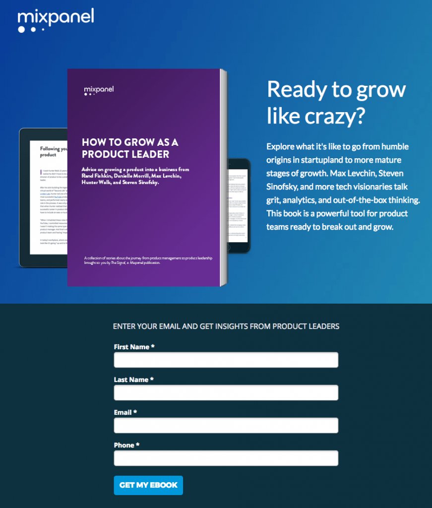
16. Mixpanel landing page example
What the page does well:
- The headline is personalized and benefit-oriented, asking visitors if they’re ready to grow their business.
- The image shows prospects that they can view the ebook on multiple devices.
- The short description of the ebook provides visitors with a brief initial overview of the ebook being offered.
- The 4-field form is quick and easy to complete, increasing the chances of visitors doing so.
- The CTA button copy uses first-person, which helps prospects feel connected to the offer.
- The “What’s Inside Your eBook” section elaborates on the short description mentioned above, outlining important points made in the ebook, as well as what product leaders discuss them. Including headshots is also a nice touch.
- No exit links make it nearly impossible to escape the page without converting. The only way to leave the page is by clicking the “X” in the browser tab or completing the form.
What to A/B test:
- The form headline is misleading. It implies that the only piece of information required is an email address when in reality, three other form fields are necessary to redeem the ebook.
- The blue CTA button doesn’t stand out because it blends in with the rest of the page’s color scheme. Testing it in a color that isn’t used anywhere else on the page might generate better conversion results.
- Adding trust signals to assure people that their personal information will be secure — like a privacy policy or security badges — could increase lead generation.
17. Infusionsoft landing page example
What the page does well:
- Social proof — company badges at the top of the page and customer testimonials at the bottom of the page — instill a sense of certainty and trust in prospects.
- The headline does an excellent job of acknowledging a visitor’s problem, empathizing with them, and then presenting a solution.
- The subheadline supports the headline well, providing some of the main benefits to working with Infusionsoft.
- The short, 4-field form only asks for basic information, making it more likely that prospects will take the time to fill it out.
- The CTA button copy tells prospects exactly what they’ll get by completing the form and clicking the button.
- The list of what Infusionsoft offers lets prospects know the benefits they’ll receive if they choose to work with Infusionsoft. The iconography and bold font help draw attention to this section.
What to A/B test:
- Adding a click-to-call feature to the phone number would make it fast and easy for visitors to contact the company, improving their overall user experience.
- Enlarging the CTA button could attract more views and likely encourage more visitors to click it.
- The CTA button color could be changed to draw more attention since green is already used in the company logo and for the small icons listed in the section below the button.
- The image would be more efficient in providing visitors with a preview of the software if it was larger and easier to see.
- The sitemap link in the footer acts as an exit link. If visitors scroll to the bottom of the page before filling out the form, they may become distracted by this and leave the page before converting.
18. GetResponse landing page example
What the page does well:
- The headline tells visitors exactly what this offer is.
- The subheadline supports the headline well, letting prospects know how they can benefit from the offer.
- The arrow acts as a directional cue, pointed directly at the CTA button, making visitors direct their attention there as well.
- The terms of service, anti-spam policy, and privacy policy are clearly placed so as to establish trust with handing over personal information.
- The three field form provides a low barrier to entry and doesn’t even require a last name to complete.
- The CTA button color is a good contrasting color that’s not used anywhere else on the page.
What to A/B test:
- The logo is linked to the home page and could easily drive visitors away from the page without learning about the offer and converting.
- There isn’t much descriptive copy. Going more in-depth about what GetResponse is and what the main benefits are could lead to more conversions.
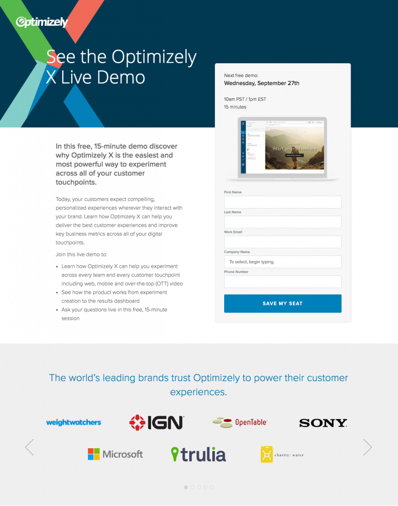
19. Optimizely landing page example
What the page does well:
- Bulleted copy allows visitors to scan the page to learn about the demo quickly.
- Encapsulating the form helps it stand out and likely drives more conversions.
- The computer image on the form provides prospects with a preview of what the demo will look like.
- The 5-field form is appropriate for a decision stage offer.
- The CTA button copy uses scarcity and urgency to persuade prospects to sign up for the demo. “Save my seat” implies that there are a limited number of seats and that there’s must be reserved.
- Company logos serve as social proof to let visitors know that Optimizely is trusted by some of the world’s leading brands. Also, the arrows in this section act as directional cues, implying that there are even more logos to see.
What to A/B test:
- Header and footer navigation should be removed because they have the potential to remove prospects from the page and reduce conversion rates.
- The blue CTA button doesn’t stand out as much as it would if it was yellow or orange.
- Social share buttons at the bottom of the page also serve as exit links, distracting visitors and driving them away from this page.
20. Flipsnack landing page example
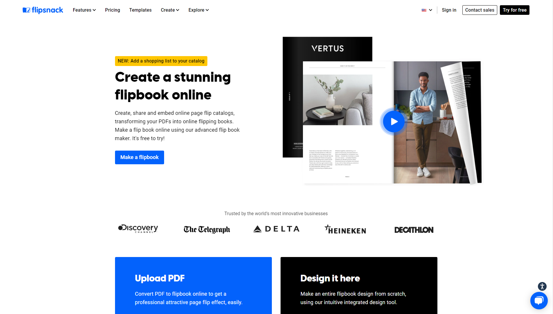
What the page does well
- A singular call-to-action at the top of the page
- The clean, simple design makes the content easier to read
- Focused messaging positions Flipsnack as the best best flipbook maker software on the market.
- An integrated sample flipbook effectively illustrates how the core product works, without being too obtrusive.
What to A/B test
- The contents of the flipbook on the page could be used to share useful information about Flipsnack but is instead simply composed of filler text.
- Some of the content could be visually streamlined.
- The social proof could be documented more thoroughly.
21. MailChimp landing page example
What the page does well:
- The word “free” in the headline is likely to pique visitors’ interest immediately.
- The supporting subheadline tells prospects how they can benefit from getting started with a free account.
- The 3-field form is short and doesn’t ask for very personal information.
- The password field improves user experience by allowing visitors to see their entry by clicking the “show” button. Also, the password requirements are clearly listed at the bottom of the page.
- No header navigation and a minimalistic footer keeps prospects focused on the goal of the page — signing up for a free account.
What to A/B test:
- Adding social proof, like a customer testimonial or a statistic about using MailChimp, would likely generate more signups.
- The transparent CTA button doesn’t stand out as much as it could. Making it darker and more contrasting would encourage more people to click.
- The CTA button copy could also be improved to include more personalized and enticing language, like “Create my free account!”
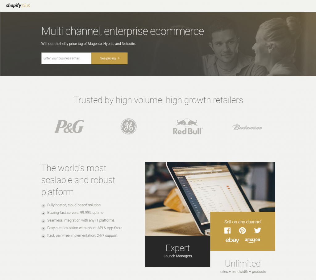
22. Shopify landing page example
What the page does well:
- The headline and subheadline contrast well with the dark background, making them attention-grabbing immediately upon landing on the page.
- Only one form field above the fold makes it easy for visitors to take action.
- Company logos and the customer testimonial serve as social proof, indicating that there are other big-name businesses and satisfied clients who trust Shopify.
- Minimal copy makes it easier and more enjoyable for visitors to navigate the page, and bullet points help draw attention to the main benefits of Shopify.
- The image gives prospects a realistic preview of the dashboard.
What to A/B test:
- The CTA button color should be changed to one that’s not already used so frequently on the page.
- Redirecting the people’s eye gaze in the image to be pointed toward the form and CTA button would encourage more visitors to look there and convert.
- The “Enterprise ecommerce” link in the footer acts as an exit link. This is the only one on the page, so removing it would likely increase conversion rates.
23. Eloqua landing page example
What the page does well:
- The headline describes the offer, and the subheadline supports it by providing additional information on what prospects can expect from the guide.
- Bulleted copy allows visitors to scan the page and pull out important information about the guide. The gray frame also helps draw attention to this section.
- The framed and color contrast around the form makes it stand out on the page.
- The orange CTA button contrasts well with the rest of the page, making it “pop” and compelling prospects to click. Also, the arrow on it serves as a directional cue.
What to A/B test:
- The “Content unavailable” text across the top of the page makes it look unprofessional.
- Adding white space around the most important elements — like the headline, image, and form — would help them stand out more and make the page look less crowded.
- The image is too small to serve its purpose. Enlarging it and increasing the resolution would make it more effective.
- Multiple exit links in the footer give visitors an opportunity to leave the page without converting.
24. Basecamp landing page example
What the page does well:
- The header serves as immediate social proof, telling visitors exactly how many people signed up for Basecamp just last week.
- The green arrow pointing to the form field acts as a visual cue.
- Only one form field surely won’t deter people from completing it.
- The option to use a Google account makes it even more convenient and compelling to sign up.
- The CTA button copy is effective because it uses first-person and the word “free”.
- Customer testimonials above the fold likely make prospects feel more comfortable with Basecamp.
- The graph at the bottom of the page is a nice inclusion because it shows visitors how much Basecamp has grown over the years.
What to A/B test:
- The header navigation provides visitors with multiple ways off the page without seeing the entire offer.
- The CTA buttons don’t stand out as much as they could because blue on the rest of the page. Testing them in orange or red might draw more attention.
- Additional exit links throughout the copy make it easy for prospects to leave the page without signing up.
- The copy is uninformative. It doesn’t say much about Basecamp itself, but simply answers three questions about the trial period. Adding detailed information about how the app can benefit users might persuade more people to sign up.
- The image of the devices should be enlarged and the hyperlink should be removed. Including it is helpful because it demonstrates all the different ways Basecamp can be used, but currently, it’s difficult to see and serves as another exit link.
25. Airbnb landing page example
What the page does well:
- An enticing headline captures visitors attention and offers a cash incentive right from the start.
- The CTA button contrasts well with the background and is right in the center of the page.
- The headshot adds a personal connection to the friend who invited you to join the service.
- The linked terms provide trust value to anyone who might be hesitant to sign up.
What to A/B test:
- Header and footer navigation are distracting and provide visitors with an easy way off the page without converting.
- Adding customer testimonials to this landing page would likely persuade more prospects to convert.
Can you beat the best landing page examples?
There you have it — some of the world’s leading companies with some of the internet’s best landing page examples.
Don’t ignore the post-click stage—provide every prospect with a personalized experience from start to finish. Sign up for an Instapage Demo today.

